Nusa CX
Improving Lay Festival Website to Engage Visitors and (Possibly) Increase Ticket Sales
Case Study
Website
Summary
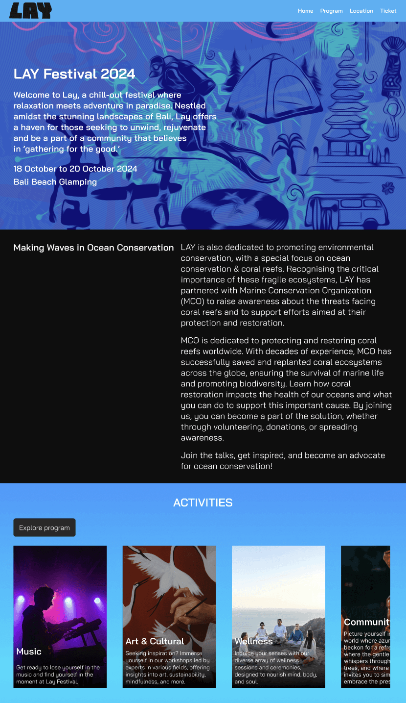
I redesigned a festival's website based in Tabanan, Bali which promotes relaxing atmosphere, art and craft activities for the family, and support the eco-marine sustainability.
The outcome from this exercise are:
1. A Figma prototype of Lay Festival website
2. A timetable/program page
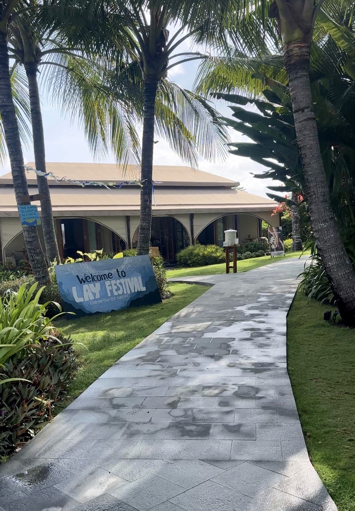
3. Some photos from the festival
Problem Statement
I won a free 3-day ticket for Lay Festival on Instagram. I didn’t know what it was, a post comes up on one of the posts from an IG account I followed. The post tagged Lay Festival’s IG, so I scrolled through their feed. Their IG posted that the festival offers yin yoga, art activities, and chill electronic music. Intrigued by their IG feed, I visited their website to get more details. I didn’t get anything. I checked their ticket prices on a link that redirects me to a ticketing website. It costs around 142 USD to get the 3-day pass! That's a crazy price for an unknown festival. The website also didn't show any photos from the previous year. I was going to cancel because I was being skeptical about the activities in the festival. But I came anyway.
When I went to their festival, the second day price is actually almost makes sense. There were many creative workshops, organization talks, and other activities. The location is also luxurious and super chill. Maybe if the website tells visitors what the festival actually offers, visitors are more intrigued to come and buy day 2 of the festival.
So I saw an opportunity to make a small redesign to the website that will also resolve my pain points, on top of the current website that is already good, but just does not provide any clear information regarding the festival.
The Solution
Step 1: List positive user journey to buy tickets.
First, I listed a general positive user journey of a visitor visiting the festival website up to visitors buying the tickets:
User sees the brief of the festival
User sees the location and date
User sees the activities of the festival
User can contact the concert provider for further questions
User sees the prices of the ticket
User buys the ticket
Step 2: List my pain points.
Second, I listed what can be improved according to my experience and a small ideation to how I would want the solutions to be.
I cannot find the exact activities/ what I’m going to do at the festival.
Possible solutions:
a. User can see the list of the activities, brief descriptions, and its providers
b. User can see the timetable of the activitiesEvery ticket purchased I saved a coral, by spending this much for the tickets, that’s fair.
But how will they save corals? It’d be great if the website provides information about the coral saver partner and what activities the partner will do (restoration, replanting, if it is, where).
Possible solutions:
a. Visitor can see the organizations relevant for this project and what actions the organizations do to promote coral saving.I cannot find the activities’ tenants. A workshop, cool. What kind of workshop? And by whom? I ended up looking for IG stories to see if Lay festival tagged anyone, or if anyone tagged Lay Festival’s IG.
Possible solutions:
a. User can see the tenants of the activities in the list of activities.Link of the location is hard to see. I needed to scroll down and really take a look at the website’s content to spot the link.
Possible solutions:
a. User can see the location on the map.
b. Make link style more obvious.
Step 3: Consolidate all the list (including the possible solutions for the pain points).
User can see the brief of the festival: title and vision
User can see the time and location of the festival
User can see the list of the activities, the time, the descriptions, and its providers
User can see the price of the ticket
User can buy the ticket
User can contact the concert provider for further questions
User can see the plan for saving the coral and who will do it.
User can see the tenants of the festival.
User can see the location on the map. Make link style more obvious.
User can see photos of past events
Step 4: Research and Idea dump.
Next is to research other renown festivals to see the best practices.
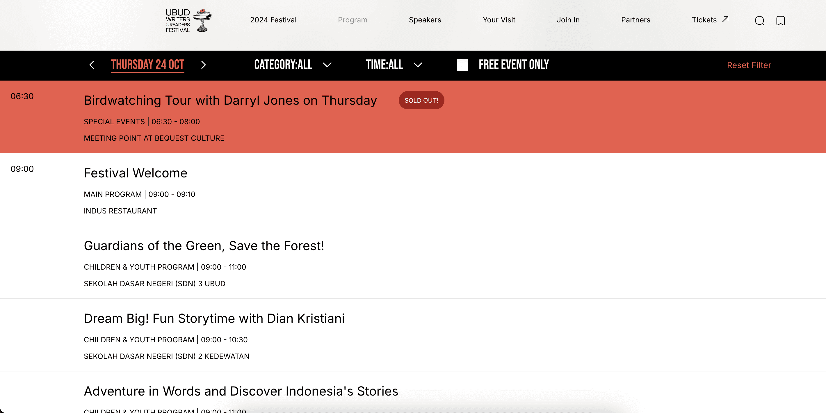
1. Ubud Writer's Festival: https://www.ubudwritersfestival.com/
The website showcases great solution to my pain point where I couldn't find any interesting workshop at the festival. The website showcases a great program or timetable to the activities: the activity, the time, the speakers, and the location.
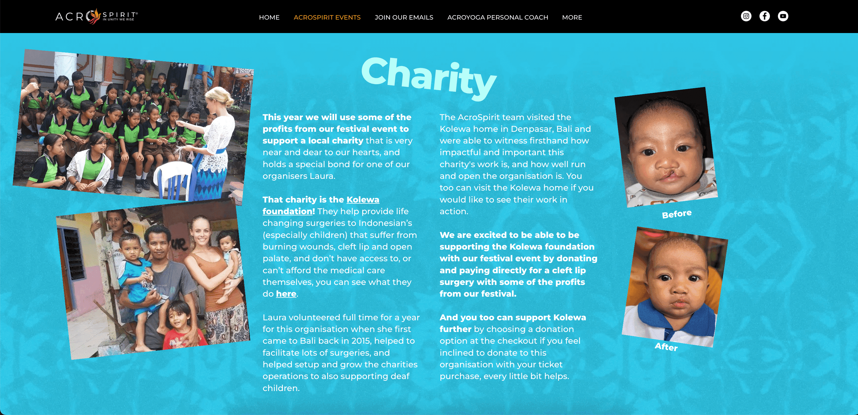
2. Acroyoga Festival Bali: https://www.acrospiritcommunity.com/acroyoga-festival-bali-2025
The website showcases good information on the festival's partnership with a non-profit organization. The site inspires solutions to showcase its Lay festival's claim.
To do an idea dump (I'm not sure if there is a more UI/UX term), I screenshot the website and doodle on the places that I think can be improved.
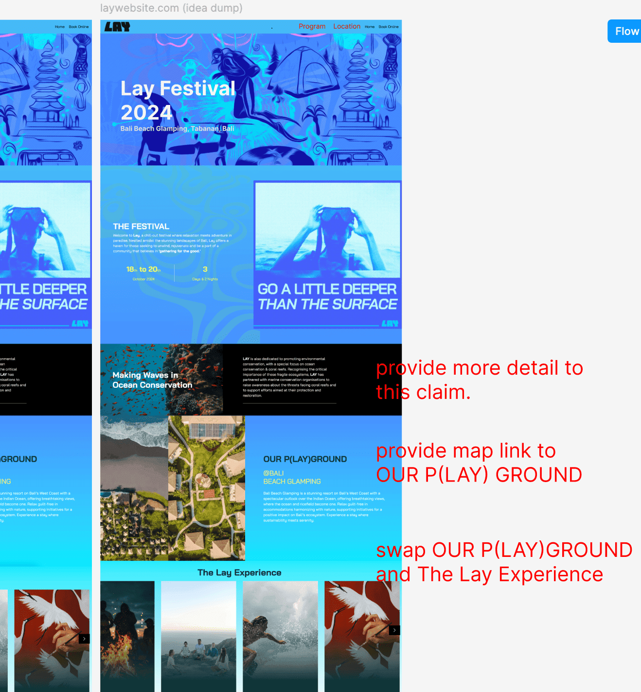
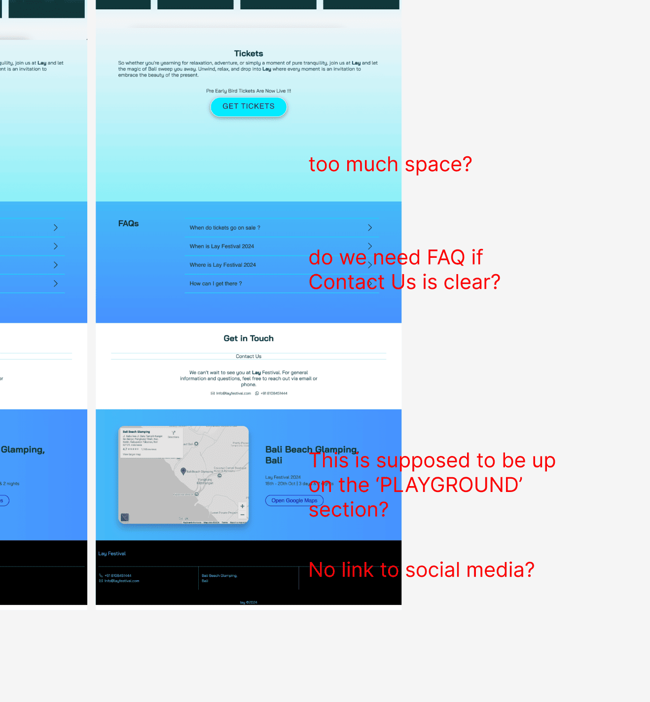
Step 5: Add the solutions to the design.
I kept the original design since redesigning is not the point of the exercise. These are the prominent changes I added to the websites and the reasons:
Added event dates and location on the hero image.
Reason: visitors have to scroll down to see the dates and locations. By adding this information here, it saves visitors time.
Added more information regarding coral conservation.
Reason: The website claims that the festival has partnered with marine conservation organizations, but it doesn't say who, what, or how. By adding this information to the section, it increases visitor's trust.
Merge the two location sections on the original website and added a button to Google Maps.
Reason: The original website shows that the location is at Bali Beach Glamping, great, but where is it exactly? And why do visitors have to scroll further down to get the Google Map location? Let me simplify it.
Added a program page. The page shows the timetable of the activities that include: workshop the time, the provider, the studio name.
Reason: There is a section 'Lay Experience' but it doesn't really tell visitors what kind of activities exactly (e.g. talks, yoga, etc.). Yogis will be interested in the yoga sessions, the family will be interested in the art and craft for the children, etc. So to increase interests, visitors must be able to see what activities, the time of the activities, and the provider who offer the activities.
Added social media on the website's footer
Reason: An active social media increases the event's credibility and ease visitors to DM or message the promotors.
Step 6: Showcase the outcome and pray the UI/UX senior designers do not judge it too harshly.
Before: layfestival.com
After: Figma prototype
